

You Can't Lie on a Mattress Through a Screen: Designing Sleepyhead's Shopify Experience
A digital journey for a home and sleep brand that has to replace touch, scale and in-store reassurance.
Executive Summary
A digital journey for a home and sleep brand that has to replace touch, scale and in-store reassurance.
Design the page around reassurance
The visual identity needed to express Sleepyhead's promise of stylish comfort and everyday living. But a calm, attractive interface was only the surface.
Underneath it, the journey had to answer practical questions:
Which product is suitable for me?
What are the exact dimensions?
Which size or configuration should I select?
How firm, soft or supportive is it?
How will it look in a real home?
What does delivery involve?
Can I return or trial it?
What exactly does the warranty cover?
A design can look premium while leaving all these questions unresolved. In that case, visual restraint becomes missing information.
We treated the storefront like a guided research space. It still had to feel like Sleepyhead, but it also had to support a considered decision with useful detail.
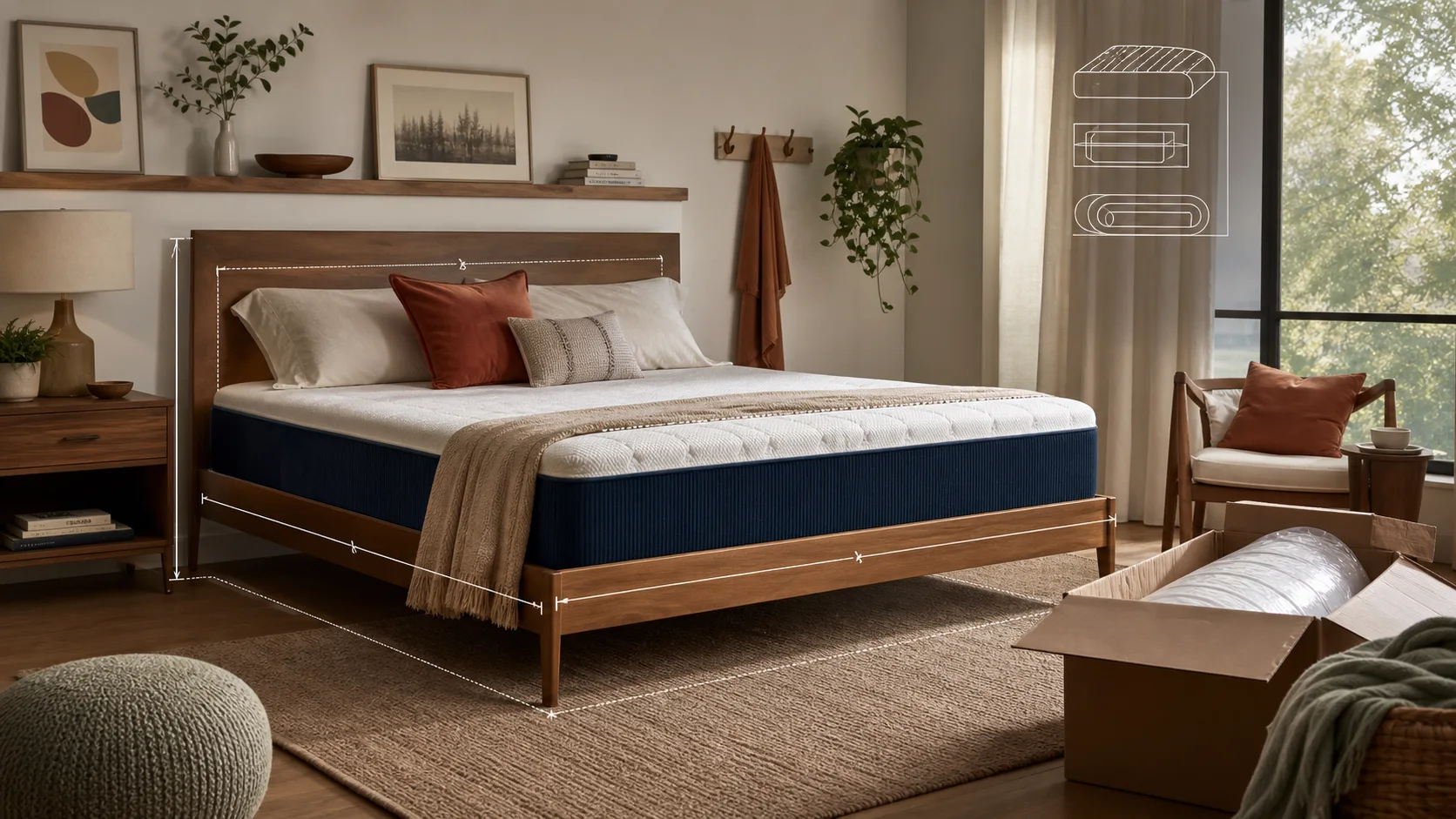
Show the product in a real room
Product photography does much of the work in home ecommerce. A cut-out image can show shape and colour, but it rarely communicates scale or how a product changes a room.
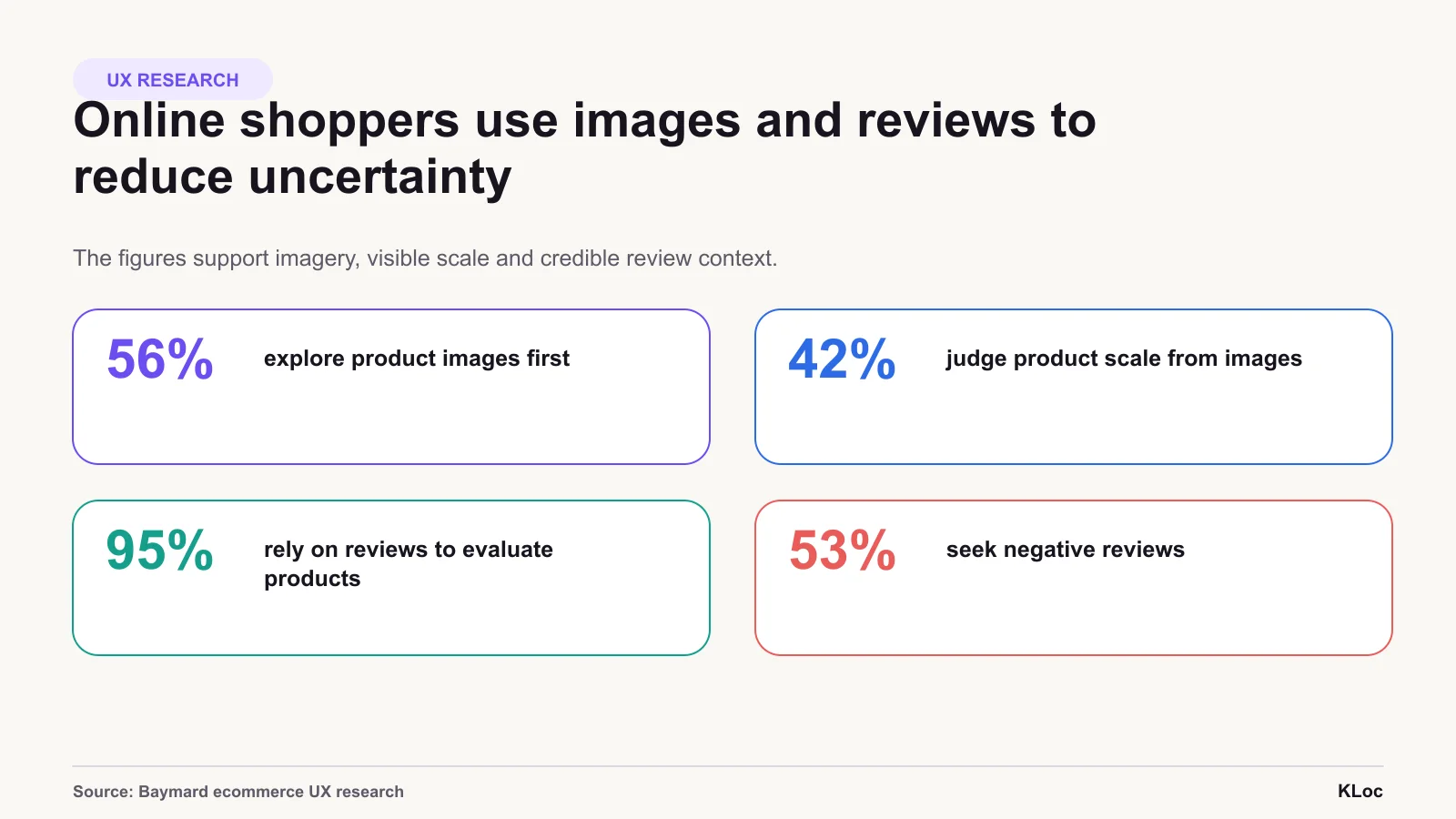
Baymard Institute found that 56% of test participants began exploring product images as their first action on a product page. It also found that 42% tried to determine a product's size through those images.
Customers use images to judge the product itself as well as the visual style.
A useful home-product gallery mixes:
Clear product-only images
Close-ups of material and construction
Lifestyle images in realistic rooms
An in-scale image with familiar objects or people
A legible dimensions diagram
Images for important configurations or colour options
Customer photography where available
The dimensions image is particularly valuable. Written measurements such as width, depth and seat height may be accurate but still difficult to translate into a physical space. Baymard's furniture testing found that shoppers often struggled to connect text measurements to the corresponding parts of a product. A labelled image reduces that mental work.
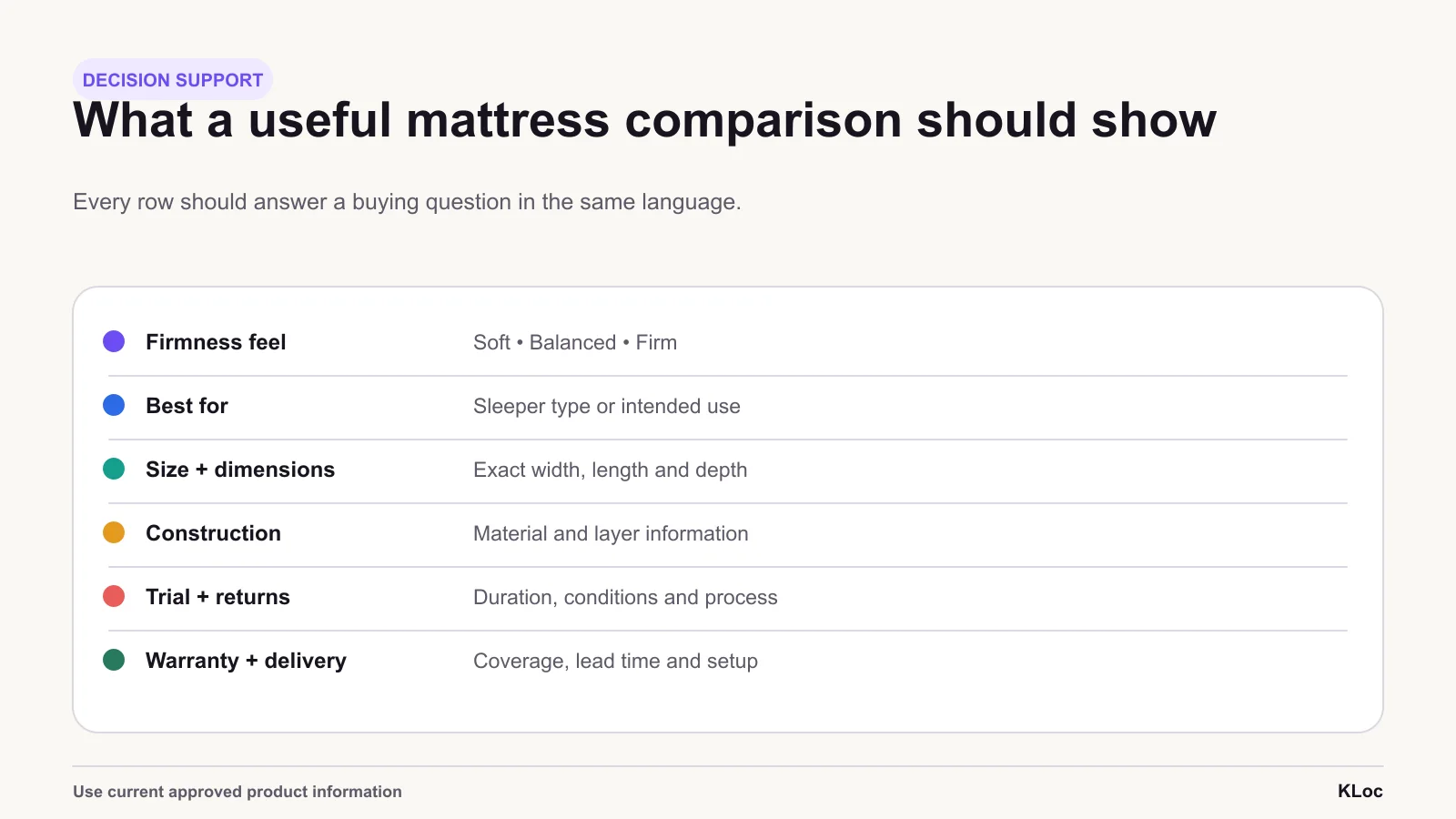
Make comparison easier than a spreadsheet
Sleep products often come with technical layers, material names and benefit claims. Showing everything at once can make comparison harder, not easier.
The content hierarchy should begin with the customer outcome, then provide evidence:
Who or what the product is designed for
The primary comfort or use benefit
Available sizes and configurations
Important material or construction details
Delivery, trial, return and warranty terms
Deeper specifications for customers who want them
The article focuses on the decision-support pattern that can be safely described: comparison, scale, specifications, trial, delivery, warranty and review context. It does not attribute a specific module to KLOC without a confirmed delivery record.
On mobile, the selected size, price, delivery information and purchase action should remain clear as the customer moves through the page. A sticky action can help, but only if it reflects the selected variant and does not cover important information.
Carry trust into delivery and fulfilment
For bulky and comfort-related products, delivery is part of what the customer is buying.
Customers need to know whether delivery is doorstep-only or includes installation, whether old products are removed, how long dispatch takes and what happens if the item does not fit. Hiding this information until checkout creates uncertainty at exactly the wrong moment.
Reviews also carry unusual weight. Baymard's product-page testing found that 95% of users relied on reviews to evaluate or learn about products. For mattresses and furniture, helpful reviews include context: the reviewer's room, body type, use case, chosen size and time spent with the product.
Answer the next reasonable question before it becomes a reason to leave. A hesitant shopper needs clarity more than another layer of persuasion.
Clear pages feel more comfortable
The final Shopify store felt consistent with Sleepyhead's visual identity and gave customers more help with a considered purchase. Calm visuals set the tone; the structure carried the detail.
No Sleepyhead uplift is invented. A measurement plan should compare product-page add-to-cart rate, mobile conversion, comparison use, support contacts, returns and engagement with delivery information over an agreed period.
The same issue appears in furniture, jewellery, appliances, bicycles and wellness products. A considered purchase needs enough evidence to build confidence before checkout.
A beautiful interface gets attention. Customers still need clear evidence before they can decide.
If a product needs more confidence than the storefront provides, KLOC can review the imagery, product information and purchase journey behind the category.
Sources: Baymard's in-scale image research, furniture dimensions research, and reviews research.
Comparison support
Comparison works when every row answers a buying question in the same language. Exact product claims and terms must come from the approved catalogue.
Trust context
Baymard research supports useful imagery, visible scale and credible review context; it is not Sleepyhead performance data.
The right team for
the work ahead.
Share the brief, the context, or the challenge. We respond within one business day.
Division 01 · KLOCOM
Commerce Engineering
Shopify Plus builds, migrations, integrations, managed services, and agentic commerce architectures.
Explore KLOCOMDivision 02 · KLOCAPPS
Custom Software
Web and mobile applications, platforms, enterprise integrations, and applied AI products built to last.
Explore KLOCAPPSDivision 03 · KLOCERS
Technology Talent
Senior individual engineers, delivery pods, and embedded engineering teams shaped around your systems and delivery brief.
Explore KLOCERS